Coffee Design Communications & Behind the Scenes of the World Specialty-Coffee Map | Q & A with Andy Reiland, Creative Director at Cafe Imports

How do we connect with a coffee company? How do they communicate their ethos with us? How does a brand become unmistakably itself—easily recognizable with a well defined personality? How can a global business speak to us in a hyperlocal way? How can design communications and marketing contribute positively to the culture?
These aren’t questions I directly asked Andy Reiland, the Creative Director at Cafe Imports, in the following interview but they were on the top of my mind as I was digging through the online presence of the green coffee sourcing company he works with, referencing their visual identity, and preparing for this Q & A. The fact is, I didn’t have to go back and look to prepare. Cafe Imports has such a well-defined brand, unmistakable aesthetic, and generous presence in our industry, I felt like I already knew them—just as you probably do, too. Andy’s work for the past 5 years as a graphic designer, photographer, videographer, and Creative Director speaks for itself. It has left a lasting impression that connects us all to Cafe Imports—even those of us who don’t buy green coffee.
In 2017, Cafe Imports released the very first edition of the World Specialty-Coffee Map—an incredibly ambitious design project and educational tool which is now in its second printing. The map project, spearheaded by Andy, was the impetus for this Q&A. However, I had so many other questions for Andy—How did he get into coffee? What does his job as Creative Director at Cafe Imports entail? What does his work strive to communicate? What inspires his designs? How did the Coffee Family Tree Project come about? How does he maintain a healthy work-life balance? So, we attempt to dig into it all! Furthermore, Andy was nominated for a Sprudgie Award last fall based on an eight-part roasting education series called Roasting Concepts that he created with Joe Marrocco—so we get into a little bit of that, too.
It is an absolute honor to share this in-depth interview with Andy Reiland, the Creative Director at Cafe Imports. I hope you are as inspired by Andy’s creative career in coffee as much as I am…

tLBCC: Can you tell us a little bit about Freehand Press and how that came to be?
Andy Reiland: Oh wow, throwback! Not sure if I haven’t updated my LinkedIn in 7 years or if you are just really great with your research. Freehand Press was a design and screen-printing business that I started out of college. I rented out a studio space with a friend to do artwork in, and the idea was to sustain the rent with screen-printing… one deadline after another, it quickly evolved into a full-on business. I operated freehand press for 4 years and eventually set down the squeegee to get back to more of a design focus. I had actually first linked up with Cafe Imports during this time, I was longtime friends with Noah Namowicz, and he would order shirts and hoodies through me for Cafe Imports when he first started working there on the sales team.
tLBCC: How did your design work lead you to specialty coffee?
Andy Reiland: Having crossed paths with Cafe Imports through screen-printing, it was the first time I really did a double take to specialty coffee. I was like, “wow, this Cafe Imports prints a lot of shirts… they must have quite an enthusiastic audience.” I had always had an appreciation for coffee and was fascinated with the ritual of it all, and the way it connected cultures. I hadn’t done much exploring into specialty coffee beyond enjoying a dark roast in a French press at the time. After freehand press, I was freelance designing in Milwaukee for a couple of years, and I would frequent the local specialty roasters at Colectivo Coffee almost every day. Their brand and cafes have incredible design work, and they were going through a rebrand from their former company name Alterra. Upon the reveal of the Colectivo brand, I was truly inspired. I actually wrote “coffee design” in my pseudo vision board-type notebook I had, and probably about 2 months later, Cafe Imports opened up a marketing position.
tLBCC: What does your job as Creative Director at Cafe Imports entail?
Andy Reiland: I blame a global supply chain and consistent industry wide caffeine consumption for me not being able to answer this question concisely. The supply chain for coffee is so complex, and being in the middle of that as an importer, we need to express ourselves in two directions: the production side, as well as the roasting side. Our marketing efforts have evolved to a team of three since I started about five years ago. We each specialize in various creative skillsets, while remaining ‘Swiss Army Knives’ of sorts—often multitasking and flexing hard skills depending on the project at hand. One huge positive of this however, is that I get to create in a wide array of media: from graphic design, photography, videography, branding, event planning, web design, e-mail marketing, and special projects like the maps, or other educational content. My role as creative director is to ensure that our department and the identity of Cafe Imports is going in a cohesive direction, while remaining creative and effective with the messages we are trying to communicate.
As Cafe Imports operations have become more specialized, we manage the visual identity for three brands and the marketing needs for five international offices. I’ve had to adapt to growing managerial and admin-type responsibilities while continuing to pursue creative projects. It has been a challenging process, but with intentional decisions and selective energy spent, I feel like my marketing team and I are putting out some of our strongest work to date.
tLBCC: Cafe Imports has such a strong visual identity. It’s so easy to tell by looking at an event poster or a burlap bag—even before reading the fine print—that something is associated with Cafe Imports. Your graphic style is very unique and usually has a lighthearted or fun twist. In other words, it’s seriously thoughtful and well-executed work, that doesn’t seem to take itself too seriously. Can you share a little bit about your creative process and what your experience has been in building this visual identity? What aspect of Cafe Imports are you trying to communicate and who are you speaking to?
Andy Reiland: Great question. Great, GREAT, question Ashley. The humorous side to our aesthetic may be half accidental and half extremely intentional. First off, I think the function of coffee is often glossed over when you go too deep with it. With all frills removed, coffee is meant to help wake people up. For those of us that have made a habit of consuming it every morning, we are usually pretty pathetic without it. Compared to other narcotics, there are not a lot of bad things to say about the beverage, so it is fun that we can rely on it to help get us through our day… it is a pleasure. So, with that humility towards coffee, I remind myself to have a fun sensibility when it comes to branding it.
All of that to say, I am pretty heavy handed when it comes to my graphic design skills. A lot of my design work leans on a more cartoony side… BUT… for coffee bag designs, burlap is an extremely rough material, and it comes in varying shades of brown… I have found that thick, black, simple lines, and bright color is one of the best options to communicate something on a burlap bag. It seems to be working out.
I’m not sure which came first, the bags or the branding, but I guess they are consistent for a reason. I always like to communicate some personality through my graphics, and luckily the personality of Cafe Imports, while being comprised of top-rate professionals and innovators in the industry, is also very approachable, creative, and smart.
Andy Reiland, contd: The culture of Cafe Imports fit my style so I think when I set out to evolve the brand it paired well. I have trouble with making stuff that is not approachable… I’m not that good.
An importer is another cog in the wheel, just as important as every other link in the coffee supply chain. If we had a brand that was too serious, or self-important, it would take the focus off of the coffee—we are not better or more important than the coffee itself.
When it comes to actually promoting coffees, and reporting on work at origin, it is something my team and I take very seriously. It is our duty as our role in the supply chain to responsibly pass along information, with respect and self-awareness. We use photography, video, and blogs for this end of our content—the aim here is to execute that with exceptional skill and accuracy. We want this more serious content to feel approachable because it is information that we are really trying to reach people with, and hopefully have passed forward to the consumer. Ensuring that this important information gets passed along the chain is where the approachability of our brand pays off.
“When it comes to actually promoting coffees, and reporting on work at origin, it is something my team and I take very seriously. It is our duty as our role in the supply chain to responsibly pass along information, with respect and self-awareness. ”
In the end, we are communicating to roasters with our brand, of course, but I also aim for the Cafe Imports brand to communicate with coffee consumers.
When I first started in coffee, I went to the SCA Expo as a consumer, and I was like “what the heck is everybody even talking about?” Surely, I know what everyone is talking about now, and more. But, I always use that version of me as a litmus test with the material we are putting out.
To keep things honest, I always ask myself, “Does it reach the consumer or is it just contributing to noise inside the industry?” I think that any coffee professional would agree that the more we can educate consumers about specialty coffee, the better the entire supply chain will benefit. I always have the consumer in mind, and that is ultimately the reach I am going for with our catalog—creating content that is appealing, approachable and unassuming so that roasters can easily pass it along to their customers.

tLBCC: Before designing the World Specialty-Coffee Map project did you have a prior interest in maps? Or any experience with map making/cartography?
Andy Reiland: I actually did! Well, kind of… for a capstone project in my Studio Art major at Macalester College, I bought a 14’x 8’ world map from the Skymall catalog and spent 4 months drawing on it with sharpie paint pens. I used it as a tool to explore the world and color in little history lessons I learned, cryptozoological myths, wonders of the world, etc. I mounted it on wood and installed clocks on all of the time zones, I strung about yarn, illustrating global connectivity and grid lines… I threw A LOT at that thing. It was really fun, it was an intriguing process, and it became a practice. I discovered that mapmaking is a way we communicate our relationship to the world. I learned a lot about the world and myself in the process, especially how naïve I was… it challenged my understanding of our global landscape and world history. It also gave me perspective on my position as a white male—not only in the context of world history, but also as one that was making marks with sharpies on a world map he bought from Skymall. I was proud of it in the end, but above all it was a great milestone boost to an ever-evolving world perspective. I think it is a rite of passage for any art major to throw their senior art project in the trash 10 years later.
I do not consider myself a real cartographer—google maps and actual cartographers did the leg work which enabled me to make these coffee maps. I am definitely a cartographic enthusiast, and could probably go as far as saying I am a cartographic designer. I have learned how to navigate the staggering loading speeds working with topographic vector files and the meticulous organizational process it takes to stylize these maps. Along the way I’ve gotten pretty good using cartographic resources and the knowledge base at Cafe Imports to decipher accurate information on a map.
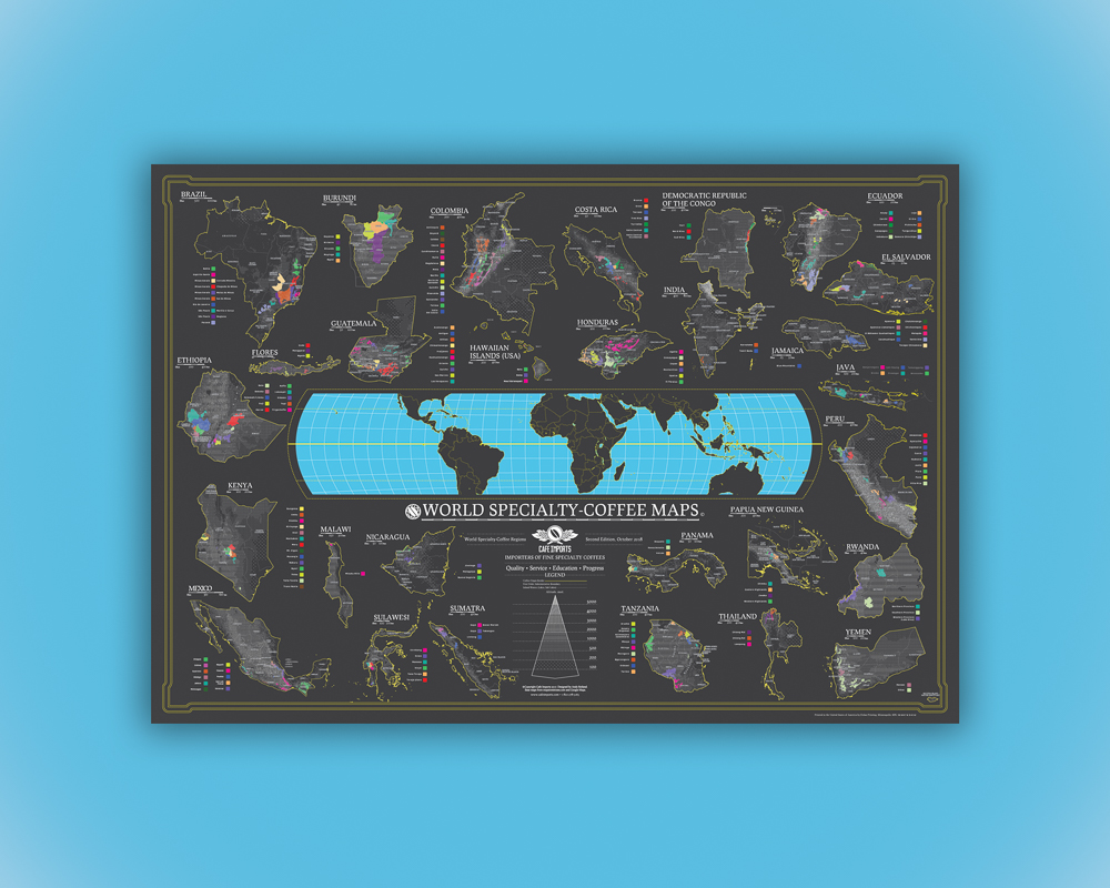
tLBCC: How did this project come about? Can you share with us some of your process and what it took to bring the World Specialty-Coffee Map to life?
Andy Reiland: On the same note as the ‘reach the consumer’ litmus test approach I try to bring to Cafe Imports creative content, when I first started in the coffee industry, I kept hearing things like “Huehuetenago” or “Chalatenago”, or “Lake Kivu.” I would go to cafés and chalkboards would say things like “Yirgacheffe” or “Guji” or “Kayanza.” And I would ask, “where are these places?” I would always turn to google and do some digging, but It seemed like a long way to go to distinguish where all of these coffees were coming from, and where those places were in relation to each other. There wasn’t a one stop shop for this.
So, long story short, within the first 6 months of working at Cafe Imports, I knew I needed to make a map to distinguish specialty coffee producing regions.
One of the challenges with this novel idea, was that Costa Rica is way, way smaller than Brazil, and taking a standard world map to render the regional footprints would prove to be impossible in a two dimensional, non-digitally interactive format. I realized that if I scaled each origin to a visually digestible size, I could work around this challenge.
So, I had the design in my head, but with other work demands, the maps became more of a passion project, and kind of a pipe dream. It was a simple idea at first, but between the learning curve of becoming efficient with the heavy map files, as well as the research involved, reaching out to our counter-parties to help distinguish the regions producing specialty coffee, the maps took a couple of years to develop.
I became kind of a broken record about it… this fictional map, and that would someday be finished. I talked about it often without much to show and I think everyone lost faith in me, I think they just entertained me by nodding and smiling whenever I would bring it up. But then after wrangling information and working on it one country at a time, I realized a couple years later that with a little more work, it could become a reality.
At this point we were about a month out from SCA Expo, and I secretly worked on it into wee hours of the night in the weeks leading up. I didn’t mention it to anybody in fear that any ounce of faith I had left from my co-workers in the workplace would completely jump the shark. I literally finished the map on my laptop on the plane to expo, and printed the prototype at the Fedex office at the Seattle Convention Center while we were setting up our booth. I pinned it up, and said “I did it, see! It’s that map I’ve been talking about!” My coworkers reactions were similar to seeing a ghost—if that ghost was holding a beautiful new world specialty coffee map they had never seen before, and only heard about in myths.
tLBCC: Were there any regions in particular that were harder to map than others? If so, why?
Andy Reiland: Some were easy! Colombia for instance. Cafe Imports is very well established in sourcing efforts at this origin, and all of the region names fall within actual political departments. The region’s growing altitudes are well documented through our traceability efforts, so all I had to do was mask the political regions, and altitudes ranges to create the regional footprints. The hardest origins were Ethiopia, Brazil, Indonesia… actually a lot of them were pretty tough. They all had a long process, where I would send a black and white outline of the origin out to our sourcing team and our counter-party for them to mark areas and communicate regional names, and in some origins colloquial names versus political names, I would start rendering based off of our consensus, we would make decisions to determine what was most accurate, and that would go back and forth until it would be confirmed by everyone involved.
Ethiopia does stand out as one of the most challenging. I did it early in my learning curve because we had a real need for that map, so I was fresh with the process, but also the political boundaries in Ethiopia proved to be challenging to research beyond the bigger political Regions and Zones. With limited accurate and up-to-date maps online, it was hard to determine Wareda’s and Kebele’s and where the reference points were when distinguishing the coffee producing regions. Like many of the maps, it required expert knowledge beyond cartographic research and Cafe Imports sourcing records, and our export partners in Ethiopia were extremely helpful in providing information that we could not obtain elsewhere.
tLBCC: Designing a world map of specialty coffee growing regions is a massive undertaking—I imagine you learned a ton while putting this together. What were your two biggest takeaways from the process— in terms of map making and specialty coffee?
Andy Reiland: As far as map making, I gained a great new skillset for organizing my adobe illustrator files so that the workflow is efficient, and the loading time is efficient. This has helped across the board, in all graphic design projects.
In terms of specialty coffee, the process of making the maps definitely made us ask a lot of questions and fully clarify some things that we may not have been forced to ask if we hadn’t set to plot everything out on a map for printing. For me one of the greatest takeaway is that visual geographical context can help further our understanding of what is behind the coffee. Not just a region on a map, but regions, plural—seeing the size of a region compared to the others in one origin, where they are in relation to each other, and how the cup quality may compare. That visual context is interesting to look at, and can provide for more holistic conversations when talking about a coffee producing region. Also, the map offers a good study on how elevation plays a factor in coffee production, and how that optimal elevation shifts as you get further from the equator.

tLBCC: Since you're onto the second edition of the map, it's safe to say the project has been received very well. What has the feedback been on the map so far?
Andy Reiland: Yeah, I think the map is celebrated mostly in a positive light. There are about 3,000 first edition versions out there, and I anticipate that this second edition will reach about the same numbers. They have also been shipped all over the world—it is really exciting to see how many places they are popping up.
I’ve had some criticism that the map discounts a vast majority of coffee production in the world. It does! It is important to remember that this is a World “Specialty” Coffee Map, which makes for such a small percentage of the worlds actual coffee production. A “World Coffee Map” could be a cool thing to explore in the future, and would be a great piece to look at to illustrate that context.
In the end it is a cool thing to have on the wall, and if it is getting people to ask those questions, then it is doing its job as a conversation piece.
Maps are a great conversation starter. Everyone has a relationship with the world map since we all live on this planet—no matter who you encounter, you have something to talk about in reference to it… and if it’s a coffee nerd, you have lots of things to talk about.
tLBCC: Since the Cafe Imports World Specialty-Coffee Map is an evolving document, what are your next steps for the map?
Andy Reiland: I plan to do yearly appraisals, to add any new updates. That was the whole idea on attaching “first edition” to the initial print, knowing that we would be evolving it. In fact, each edition has an indication on the bottom right corner for what printing it is within that edition… just like a book. This gives room to make adjustments within the editions if there are new findings. The first edition, first printing is missing a region that we started buying from in Papua New Guinea, for instance, so we added that into the second printing of the first edition.
Beyond keeping the map flexible, and allowing it to evolve over time to reflect Cafe Imports sourcing efforts, and the progressing trends in specialty development in various origins, I hope to send individual Origin maps to print, at a larger scale, on 18’x24’ paper. I have these maps already formatted, but with the larger scale depiction it offers the opportunity to render more detail, like airports, and ports, and a more specific range of elevation… so I’ve got it on ice until I can go deeper with it. I would also like to do more colorway options of the map, I plan to introduce a light background option for the third edition.
And in my next lifetime, we will have digitally interactive maps that have videos and photo albums of each region when you zoom in and click on them ☺.
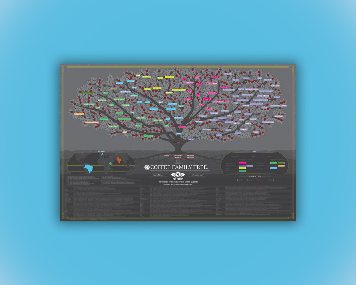
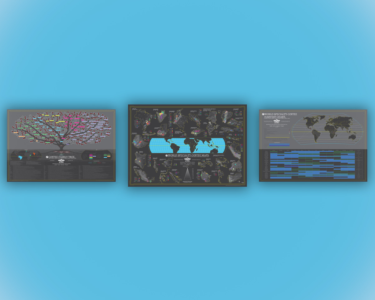
tLBCC: You also recently released a Coffee Family Tree—is this a new project as well? Can you share a little bit about it?
Andy Reiland: Okay, so the Coffee Family Tree! This thing was a monkey on my back for some time. I say this because it was developed before I started working at Cafe Imports, The early copies of the Coffee Family Tree were extremely popular, you can go into many Specialty coffee shops or Exporter offices (some Importer offices, too) and there would be a high chance they had it hanging up in their roast lab. It was on my list of to-dos to update it for a while because it was outdated with its branding.
I knew from the start that it was going to be really difficult to update, because our industries understanding of Coffee Varieties has skyrocketed since the early days when that Family Tree was created. It was beautifully designed, and gave the observer a general understanding of how some coffee varieties related to each other, but by today’s standards it didn’t really say much. I know that in order for us to come out with an update, it would have to be dense with information, and that information would have to be bullet proof. That is where I stepped back, and had Café Imports Editing Manager Ever Meister, and Cafe Imports sensory Analysis director Ian Fretheim take the wheel. Ever and Ian researched the varieties depicted on the tree extensively, and they were able to give me all of the information needed to have the tree actually educate, instead of just look pretty on the wall.
The problem here as well was that relationship between coffee varieties doesn’t actually work like a tree at all… it does in some cases when there are direct lineages. But, when you have a hybrid of 5 different varieties, you can’t have 5 tree branches miraculously curve around the tree and meet to form a new branch. But since the tree was so popular, it was worth trying to figure out a way to make that motif still work.
After some extensive visualizing and experimenting, I was able to create a key that distinguished hybrids or crosses vs. direct lineages, and I designed the tree in a way where the tree leaves played a factor—covering up branches, and letting new branches, i.e. hybrids or crosses form out of nowhere, without a direct lineage… hard to explain, but it works visually.
Beyond that, we printed the tree at a much larger scale, so that we could fit more keys, a brief history to communicate how coffee migration influenced variety distribution and evolution, as well as a description for each variety on the tree, listing its derivation, location of origin, and origin story… we were able to achieve this by printing in the smallest yet (subjectively) still legible font on the market.
We also created a third poster for this series to form a specialty coffee triptych of sorts–the World Specialty-Coffee Harvest Chart. It’s a little more playful than the Coffee Family tree and the Map, it depicts “typical” harvest dates for each origin that is displayed on the map, as well as the “typical” arrival months. It also has a world map included that shows (simplified) ocean freight shipping routes. The aim here was to create a tool to help understand the coffee year cycle. There are an incredible number of factors that can contribute to a coffee harvest shifting, climate change and challenges being a major factor, but this chart can help give context to when a harvest might be “early” or “late”. The shipping map is the more playful element, it depicts the major shipping trade routes so we can imagine the long journey coffee takes to get from point A to point B. Shipping is probably the least celebrated or glorified link in the coffee chain, but it is as significant as anything else, and it’s got a glorified place on this chart.

tLBCC: Aside from the Cafe Imports World Specialty-Coffee Map and the Coffee Family tree, are there any other designs or creative projects that you are especially proud of?
Andy Reiland: This year we were I worked on an eight-part roasting education series with Joe Marrocco called Roasting Concepts, I was able to hammer out some animation skills (through 6 months of head pounding and face palms) and it was recently nominated for a Sprudgie.
Cafe Imports also just opened an exporting office in Costa Rica for the 2018-2019 harvest. “Cafe Imports” was too generic to incorporate in a Spanish speaking, coffee producing country, so we had to come up with a new name: “Oxcart Coffee.” It made for a really fun new company branding and office build out project that was just recently completed to kick off this season’s harvest.
But, what I am definitely most excited about now that this poster series is checked off is another project that has been years in the making. The Cafe Imports team and I have been working on a “how its made” type video series that explores the core coffee processing techniques in narrated detail. I just finished filming the natural coffee process in Ethiopia in December, which is the last video we needed to have a comprehensive coffee processing series. We are planning to publish the Washed, Honey, Wet-hulled, and Natural video in 2019.
tLBCC: Your work with Cafe Imports has taken you to coffee growing regions all over the world. Are there any trips that have particularly inspired you? How have your travels influenced your designs?
Andy Reiland: Every travel experience and coffee producing area offers incredibly special and memorable experiences, it is hard to place any of them in front of another. Recently I found Papua New Guinea, Sulawesi, and Sumatra very inspiring. I hadn’t reached the Asia Pacific coffee producing countries until after I had seen Central America, South America, and Africa, and perhaps it was so inspiring because I had on my radar for so long, But the Asia Pacific is possibly the furthest away from home that I could be, and I was undeniably awestruck by the landscape—it offers such a different environment from a coffee production lens. It was also particularly exciting to travel throughout the Asia Pacific and be able to experience such a vast range of culture from one island to the next.
Travels have definitely inspired my designs. When I am visiting these different origins I am observing as much art as I can—the traditional art, signs, patterns, but even things like music, architectural/interior design, or the ways that the buildings are painted. I take in as many visual cultural cues as possible so that I can be equipped when visual decisions need to be created or made to compliment the coffee.
One thing that I hope to land on is working with more local artists to help with the authenticity and non-appropriation of the works. I strive to take safe, intentional, and respectful approaches to depict artwork for origins in a non-appropriated way, but I would love to actually work with fellow artists to help promote these coffees. I recently was able to collaborate with a folkloric Artist in Costa Rica for the Oxcart Coffee branding, I went down to San Jose for the office build out to paint some murals and we wanted to incorporate the traditional Costa Rican oxcart wagons somehow, and I was not about to assume that I could just go ahead and paint that, so we reached out. It’s a hard thing to do logistically, especially with the urgent timing required in coffee logistics, but I hope to work with more artists in various countries to celebrate the coffees and cultures involved with quality artwork.
tLBCC: Your creative work—graphic design, videography, photography, cartography— is very labor intensive and I imagine it requires a lot of long hours in front of a computer screen. Do you have any tools, routines, or structures in place that help you keep a healthy work-life balance?
Andy Reiland: Anti-glare computer glasses are huge help for screen time fatigue… that’s a good place to start, there’s no way around looking at a screen too much in the visual design field these days.
I think community and communication with people that care about you is an extremely important thing to have in order to balance the disconnection that can foster when living behind a computer screen most of our day. Good nutrition, exercise, and sleep is essential. I focus on the energy of the food that I consume, I do yoga, and I meditate daily. Turning my mind off with some TV and knowing when to rest is crucial—the same goes for stepping away from a project to come back later with fresh perspective.
I was forced into my self-care practices by necessity; all-nighters, saying yes to everything, and over extending my work hours into personal time was a regular thing for me for the decade of my life after college. I know the value of healthy work life balance, and in order to stay creative and not burn out, it is imperative that you work to become busy 80% of the time, vs. busy 110% of the time.
Planning is key. Its really easy to get caught up in a project, to let deadlines take over your life.
The more that you can plan your projects, and factor in plans for self-care practices, the better you can create and sustain a long-term vision. If you have a long-term vision, you have a better foundation to help make decisions on what to spend your energy on, and especially what not to. It is important to check in on that vision often to keep it in focus, and to evolve it based on your new experiences.

tLBCC: Knowing what you know now about having a creative career, if you had the ability to go back in time and give the younger, less experienced version of yourself—who is just starting out—a piece of advice, what would it be? And why?
Andy Reiland: Learn Spanish.
Other than that, it would be to watch tutorials immensely. If you are noticing something is taking too long, and thinking, “there’s got to be a quicker way to do it,” then there probably is. Taking the time to literally just google a problem, or a seemingly slow way to do things, will lead you to resources that make workflow miraculously faster.
The key here is being able to recognize these inefficiencies, which comes with more experience or good teachers. To this day I still learn simple little tricks that if I would have known from the start, I would have saved years of head pounding. Learning to recognize inefficiencies, and knowing how to teach yourself goes a very longways.
tLBCC: Do you have any thoughts or words of wisdom for designers who have a specific interest in getting involved in specialty coffee?
IAndy Reiland: I can’t say this is the absolute way to go, because sometimes I can be a little too removed from the trends of our industry, but I prefer to draw influence from outside specialty coffee. It’s hard to do if your first love is coffee, but having a variation in influence can help bring new ideas and styles to the visual landscape of our industry…be different. From a subject perspective, I think it is important to be interested in the coffee, but it is more interesting to be more interested in the people, place, and culture behind that coffee. Coffee is a by-product of this.

tLBCC: What is your favorite part about working in specialty coffee?
Andy Reiland: Probably the best part is that anywhere you go, you can feel out where the specialty coffee is through a google search. It is a great way to experience travel through different towns and cities, or countries. Chances are you have some things in common with the employees, and you might even know each other. It becomes a very small world very quickly, and the specialty coffee world is incredibly connected through the global nature of its trade.
On another, specific note, sending print files for coffee bags to origin and seeing how it comes back is one of my favorite things I get to do as a creative director at an importer. Perhaps it is my screen-printing roots, but I am just so fascinated by it—know how much tireless work goes into printing so big and on such rough material. Often times The Cafe Imports logo is stenciled, or designed by hand, and it gets awkwardly translated… this is why this is one of my favorite things… in any other industry as a creative director, I would be forced to lay down the law for brand consistency, but strangely deconstructed, misshapen, or reimagined Cafe Imports logos are arguably a more authentic representation of our logo—it is testament to the vast supply chain “game of telephone” in coffee, and it also carries the character and nuance in variation from the places specialty coffee comes from.
tLBCC: When you are not working on creative projects where are we most likely to find you?
Andy Reiland: The grocery store, yoga studio, Crossfit gym, comedy club, café, or vegan comfort food restaurant.